The most breathtaking villa interior color schemes do more than just decorate a room; they tell a story, evoke emotion, and create an unforgettable atmosphere. Color is the silent language of interior design, capable of transforming a grand space into an intimate sanctuary or a simple room into a vibrant masterpiece. In the world of luxury Dubai villas, mastering the art of color is fundamental. This exploration will guide you through creating sophisticated villa interior color schemes that resonate with style and personality.
The Psychology of Color: More Than Just Paint on a Wall
Before diving into specific palettes, it’s essential to understand the powerful psychological impact of color. The shades you choose for your walls, furniture, and accents directly influence the mood and energy of your home. A well-considered color strategy is the foundation of any successful interior, setting the stage for every other design element. This understanding is key to unlocking the potential of your villa interior color schemes.
How Color Shapes Mood and the Perception of Space
Colors have an innate ability to affect our feelings. Warm tones like soft terracotta and beige can create a cozy, welcoming environment, while cool hues such as muted blues and gentle grays evoke a sense of calm and tranquility. Color also manipulates our perception of space. Lighter shades tend to make a room feel larger and more open by reflecting light, whereas darker, richer tones can make a large space feel more intimate and dramatic.
Color Considerations for Dubai’s Abundant Natural Light
Dubai is blessed with brilliant, intense sunlight for most of the year. This is a critical factor when selecting villa interior color schemes. The same shade of paint can look dramatically different under the cool light of morning versus the warm glow of sunset. It’s often wise to choose colors that are slightly more muted than you might initially think, as the strong natural light will amplify their intensity. Testing samples on your walls at different times of day is a non-negotiable step.
Exploring Foundational Villa Interior Color Schemes
While the possibilities are endless, most successful color palettes are built on established design principles. Understanding these foundational schemes provides a framework for creating a look that is harmonious and intentional. These approaches form the basis of many stunning villa interior color schemes, offering a starting point for both classic and contemporary aesthetics.
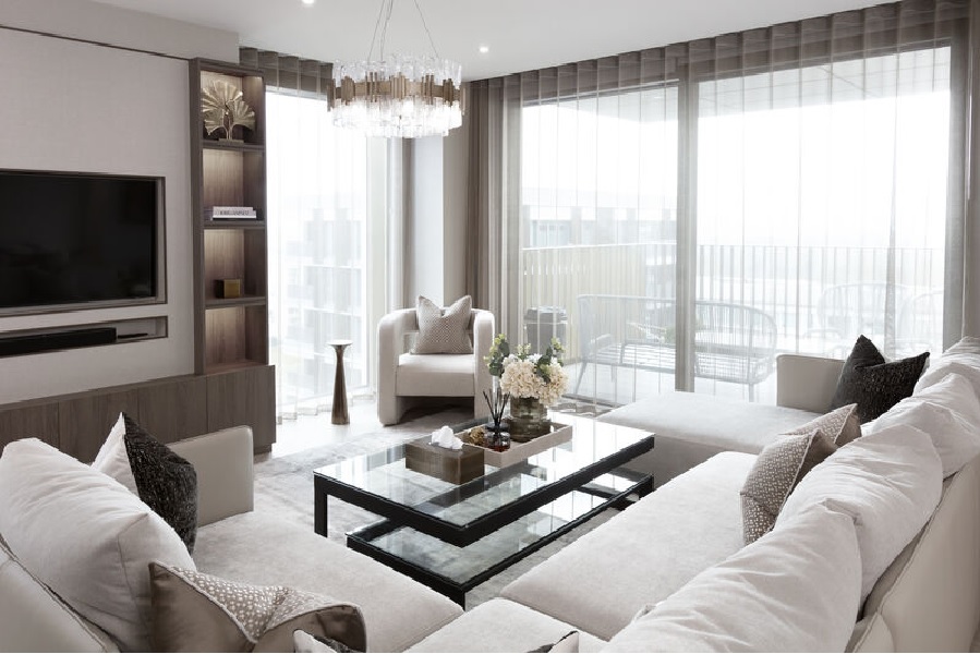
The Timeless Elegance of a Monochromatic Neutral Palette
A monochromatic scheme uses varying tones, shades, and tints of a single color. When applied with neutrals—think of a palette built around shades of cream, beige, or grey—the result is incredibly sophisticated and serene. This approach creates a calm, cohesive backdrop that allows textures and materials to shine. To prevent it from feeling flat, introduce depth through a rich variety of materials like linen, bouclé, wood, and stone.
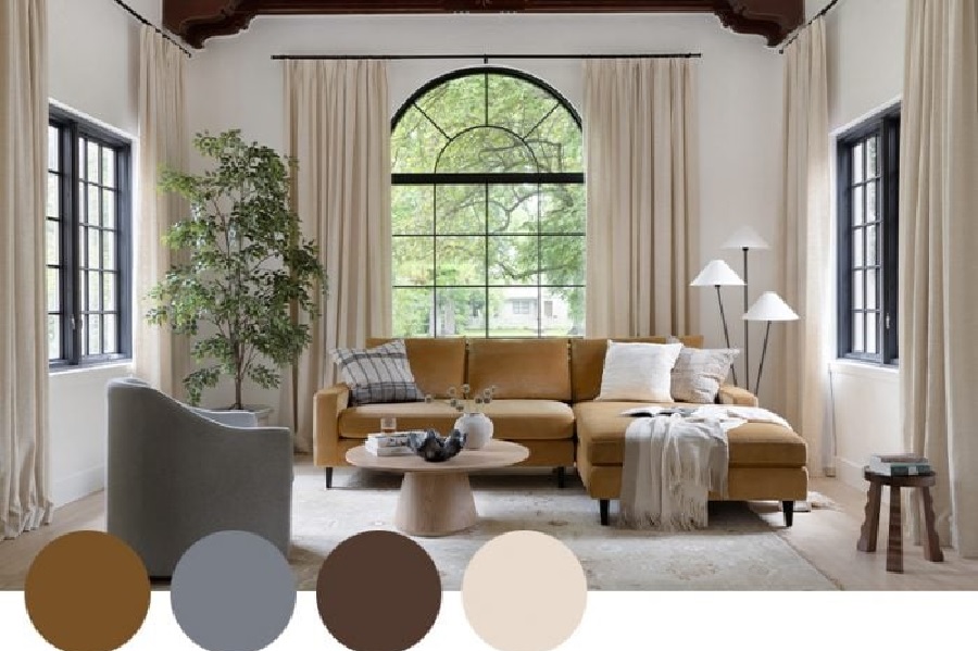
The Understated Sophistication of an Analogous Palette
An analogous color scheme uses colors that are next to each other on the color wheel, such as blue, blue-green, and green. This creates a serene and comfortable design that is harmonious and pleasing to the eye. In a luxury setting, this could translate to a palette of soft gold, warm beige, and creamy off-white. The effect is richer than a monochromatic scheme but still feels calm and cohesive, making it a versatile choice for elegant villa interior color schemes.
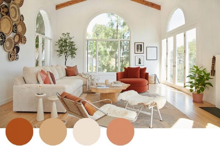
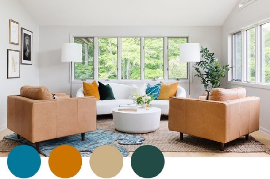
The Bold Statement of a Complementary Color Scheme
For a more dynamic and energetic look, a complementary scheme uses colors that are opposite each other on the color wheel, such as blue and orange or green and red. In a luxury context, this doesn’t mean painting walls in bright primary colors. Instead, it involves using muted or deeper versions of these hues. For instance, a deep navy blue living room could be energized with accents of rich terracotta or cognac leather, creating a look that is both bold and beautifully balanced.
Applying Villa Interior Color Schemes: The Designer’s 60-30-10 Rule
Once you have a palette in mind, a trusted design principle for applying it is the 60-30-10 rule. This simple formula helps create a balanced and visually appealing space, ensuring that your colors are distributed harmoniously. It’s a professional secret for executing flawless villa interior color schemes, taking the guesswork out of the application process and leading to a polished, curated result every time.
The Dominant Color (60%): Creating the Room’s Foundation
The dominant color should cover approximately 60% of the room. This is typically the color you see the most and forms the backdrop for everything else.
- This includes elements like:
- Wall color
- Large area rugs
- Major furniture pieces like a sofa
The Secondary Color (30%): Adding Depth and Interest
The secondary color makes up about 30% of the space. Its role is to support the main color while adding a layer of interest and contrast. This color can be used for accent chairs, curtains, bed linens, or a feature wall. It should be different enough to create contrast but still work in harmony with the dominant hue. This is where you can start to introduce a bit more personality into your villa interior color schemes.
The Accent Color (10%): Infusing Personality and Focus
The final 10% is reserved for the accent color. This is your “pop” of color, used sparingly to add energy and draw the eye to key points. It’s perfect for smaller items like throw pillows, decorative accessories, and artwork. Because it’s used in small doses, this is your opportunity to be bold and use a more vibrant shade that you love but wouldn’t want on your walls.
The Interplay of Color, Texture, and Material
A truly masterful interior is about more than just color; it’s about how color interacts with texture and material. A single color can look entirely different on a velvet cushion versus a silk curtain or a plaster wall. A sophisticated approach to villa Interior design in dubai involves a deep understanding of this interplay, creating a space that is rich in sensory detail.
Using Texture to Add Depth to a Simple Color Palette
Texture is what prevents a neutral or monochromatic color scheme from feeling boring. By layering different textures, you create visual weight and interest. Think about combining a variety of surfaces:
- Rough textures: Natural linen, raw silk, or a grasscloth wallpaper
- Smooth textures: Polished metal, lacquer surfaces, or glass
- Plush textures: Velvet, mohair, or a deep-pile wool rug
Harmonizing Colors with Materials like Marble, Wood, and Metal
The colors you choose must complement the fixed materials in your villa. The warm, golden veins in a Calacatta marble slab can inspire a palette of cream, gold, and soft beige. The rich, dark tones of a walnut floor might call for a contrasting palette of cool greens and greys. The finish of your metal fixtures—be it brushed brass, matte black, or polished chrome—should also be considered part of your overall villa interior color schemes.
Creating Cohesive Villa Interior Color Schemes Across Your Home
One of the hallmarks of a professionally designed villa is a sense of flow and cohesion from room to room. This is largely achieved through a masterfully planned color palette that unifies the entire residence while still allowing individual spaces to have their own identity. Thoughtful planning of your villa interior color schemes is what creates this seamless, harmonious experience.
Establishing a Whole-Home Palette for Seamless Flow
Start by selecting a core palette of three to five colors to be used throughout the home. This doesn’t mean every room will look the same. Instead, you can vary the application. For example, the dominant neutral in your living room might become an accent color in the bedroom, while the accent color from the dining room could be the main wall color in a powder room. This creates a subtle thread that connects the spaces.
Crafting Your Perfect Palette For Villa Interior Color Schemes
Choosing the perfect villa interior color schemes is a deeply personal journey. It’s about creating a backdrop that not only looks beautiful but also feels right for you and your lifestyle. Color has the power to transform your house into a home, reflecting your personality in every room. The principles we’ve discussed provide a starting point, but the true magic happens when they are tailored to your unique vision.
At Lux Dubai Interiors, our expertise lies in translating your vision into a sophisticated and cohesive reality. Our designers are masters of color, light, and texture. We work with you to craft a palette that is both timeless and deeply personal. Ready to paint your own story of luxury? Contact us today for a color consultation.
Frequently Asked Questions
What are the most timeless colors for a luxury villa?
Neutral colors like shades of white, cream, beige, and greige (a mix of grey and beige) are timeless. Deep navy blue and rich forest green also have a classic, enduring appeal when used thoughtfully.
How can I use dark colors without making a room feel small?
Use dark colors in a room with ample natural light. Pair them with light-colored flooring and ceilings, and use mirrors to reflect light. Applying a dark color to a single feature wall is also a great strategy.
What’s the best way to test a color before painting?
Paint a large sample board (at least two feet by two feet) and move it around the room at different times of day. This shows you how the color changes with the light, which is better than a small swatch.